Is Civilization VII's UI as Bad as Advertised? A Critical Analysis

Civilization VII's Deluxe Edition launched recently, and online discussions are rife with criticism of its user interface (UI) and other perceived shortcomings. But is the UI truly that flawed? This analysis dissects the game's UI, comparing it to established principles of effective 4X game interface design.
← Return to Sid Meier's Civilization VII main article
Assessing Civ 7's UI

Early impressions of Civ VII, particularly its UI, have been largely negative. However, a balanced assessment requires a detailed examination of its components against the benchmarks of a successful 4X interface.
Defining a Superior 4X UI
While objective standards for 4X UI design exist, the ideal UI is context-dependent. Game style and goals influence UI effectiveness. Nevertheless, successful 4X UIs share common traits. Let's evaluate Civ VII against these key elements:
Information Hierarchy
A good UI prioritizes essential gameplay information. Frequently used resources and mechanics should be prominently displayed, while less crucial features should be easily accessible. The UI shouldn't overwhelm the player with unnecessary detail.
Against the Storm provides a strong example. Building menus are clearly organized by tabs, prioritizing common actions and relegating less frequent functions to subsequent tabs.
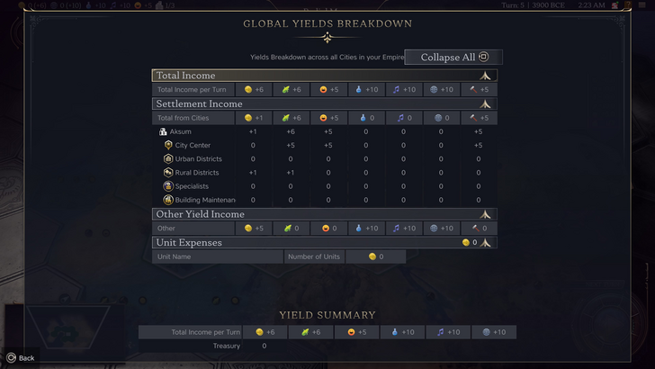
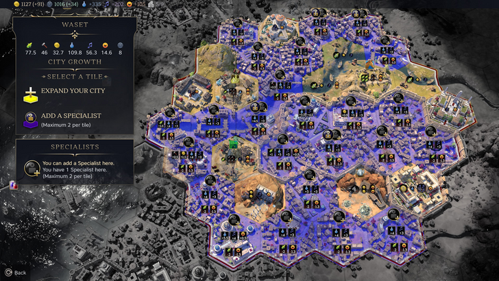
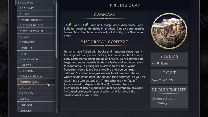
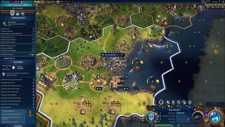
Civ VII's resource summary menu effectively separates income, yields, and expenses. However, it lacks granular detail. While resource origins are shown at a district level, specific hex-level information is missing. Expense breakdowns are also limited. The UI functions adequately but could benefit from increased specificity.
Visual Indicators
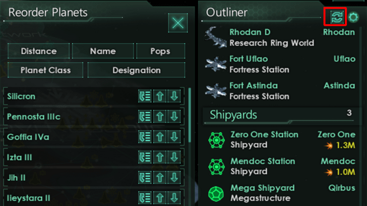
Effective visual indicators (icons, colors, overlays) convey information quickly and intuitively. Stellaris's Outliner, for instance, uses icons to instantly show ship status.
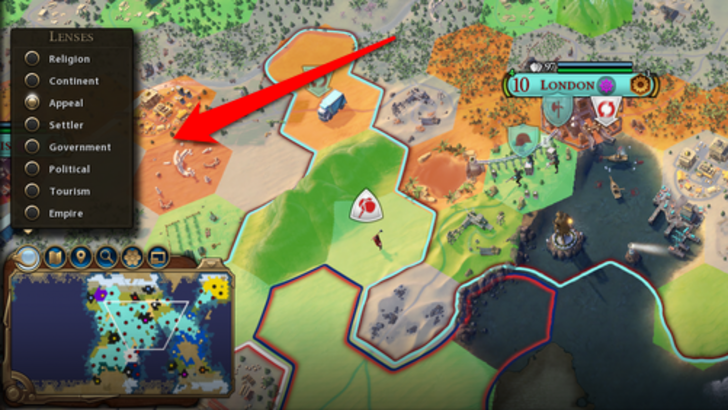
Civ VII utilizes tile yield overlays and settlement overlays effectively. However, the absence of certain map lenses from Civ VI (e.g., appeal, tourism) is a point of contention. The lack of customizable map pins is another common criticism. While not disastrous, improvements are possible.
Search, Filtering, and Sorting
In complex 4X games, robust search, filtering, and sorting options are vital. Civ VI's comprehensive search function allows players to easily locate specific resources or units on the map.
Civ VII's lack of a comparable search function is a significant drawback, hindering usability. This omission is a major usability issue, hopefully addressed in future updates.
Design and Visual Consistency
UI aesthetics and cohesiveness are crucial. Civ VI's visually appealing and thematic design enhances the overall experience.
Civ VII adopts a minimalist, sleek aesthetic. While not inherently flawed, its subtle thematic direction may not resonate with all players. The visual design is subjective, but the lack of immediate clarity is a valid criticism.
Conclusion: Not the Worst, But Room for Improvement
Civ VII's UI, while not exceptional, doesn't deserve the extreme negativity it's received. While key features are missing (especially the search function), these aren't game-breaking. Compared to other issues, the UI's flaws are relatively minor. While it pales in comparison to some more visually striking 4X UIs, its strengths shouldn't be overlooked. Future updates and player feedback will likely lead to improvements. The UI's shortcomings don't overshadow the overall game experience.
← Return to Sid Meier's Civilization VII main article
Sid Meier's Civilization VII Similar Games

 Latest Downloads
 Downlaod


 Top News