Receiving an unexpected call from Nintendo of America's president is not something you question—you answer it.
That’s the advice designer Chris Maple received from a colleague in 1998, preparing him for a call that would come later that day. Maple, who ran Media Design, a firm known for handling urgent, high-pressure projects, was no stranger to such calls. His company had built a solid reputation in Seattle, working discreetly with clients like Boeing, the Seattle Mariners, and Holland America Line, often stepping in when other agencies couldn’t meet tight deadlines or complex demands.
Years into his career, Maple got a call from the secretary of Minoru Arakawa, then-president of Nintendo of America, inviting him to their Redmond office. The brief was vague: they needed help with a new game. Intrigued, Maple accepted, unaware he was about to play a pivotal role in shaping Pokémon, one of the world’s biggest cultural phenomena.
Bringing Pocket Monsters to the West
“I arrived and waited in their lobby for about half an hour, staring at this stunning 21-inch crystal horse head,” Maple recalls of his visit to Nintendo’s Redmond headquarters. “It was mesmerizing. In corporate settings, I’ve learned to read the room, picking up on subtle cues to understand what’s needed. That crystal horse head set the tone as I sat in Nintendo’s lobby.”
Maple was eventually ushered into a meeting room where a small group awaited. “It felt like an inquisition was about to begin,” he says. But when Arakawa walked in, Maple was struck by his commanding yet charismatic presence.
Here’s how Maple remembers the conversation unfolding:
“Arakawa introduced himself and explained they were launching a game in the U.S. and Europe. Previous agencies had failed to deliver, burning through the budget and time. He asked if I was up for the challenge. I said, ‘Sure, but it’ll cost you.’”
“Then, someone brought in a cardboard box and dumped toys, papers, and odd sketches onto the table. I looked at them, then at Arakawa, and asked, ‘What’s this?’ He replied, ‘It’s a Pocket Monster.’ I said, ‘What’s a Pocket Monster?’ He clarified, ‘It’s Pokémon. That’s what we’re calling it.’”
Maple was tasked with designing a new logo for Pokémon, a game then known in Japan as Pocket Monsters Red and Green. Nintendo planned to launch it in the West as Pokémon Red, Blue, and later a Yellow Pikachu Edition. They needed a logo to match the rebrand from “Pocket Monsters” to “Pokémon,” but previous attempts had fallen short. Maple was given no specific guidance—just a one-month deadline.
The Elusive Crystal Horse Head Mystery
For days, I’ve scoured the internet for traces of the crystal horse head Maple vividly recalls. He says it was his first impression of Nintendo, possibly influencing his iconic logo design. But evidence is scarce. The horse head doesn’t appear in rare footage of Nintendo’s old lobby (the company relocated in 2010, and the old office is now a tennis court). Former employees and regular visitors from that era don’t recall it, though some suggest Maple may have been in a private lobby not typically seen by the public. Nintendo and The Pokémon Company ignored my inquiries, and searches through industry veterans, DigiPen, and The Video Game History Foundation yielded nothing.
Update 7:21 a.m. PT: Shortly after this article went live, a tip led me to David Sheff’s book Game Over, which confirms the horse head’s existence on page 198: “In the lobby of NOA’s headquarters is a smoky glass coffee table and a crystal horse’s head in a glass case.” I’ve reached out to Sheff for more details or photos.
If you know anything about this mysterious crystal horse head—memories, details, or ideally a photo—please contact me at [email protected]. I’m eager to learn more.
Infusing Energy into the Design
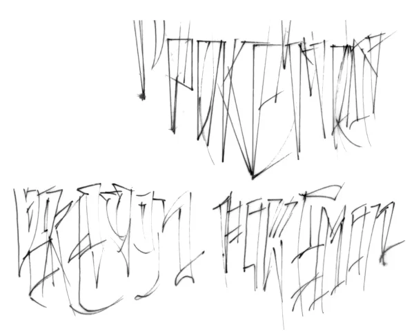
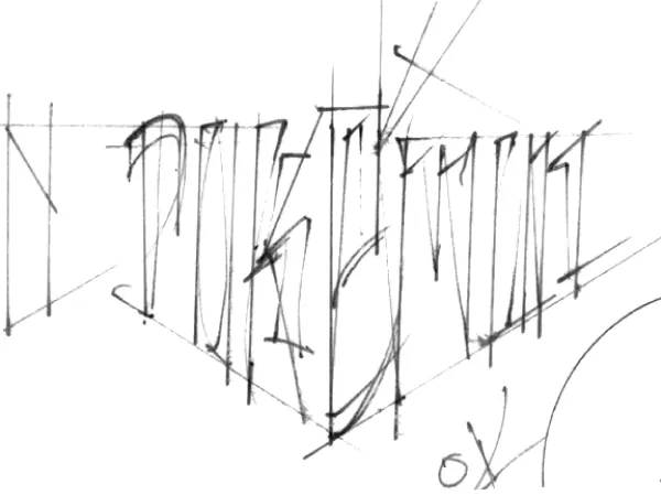
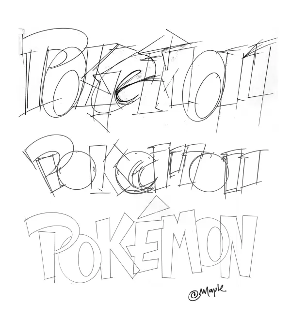
Typically, a logo project like this would take six months, with rounds of revisions and client feedback. Nintendo’s one-month deadline, tied to Pokémon Red and Blue’s E3 1998 reveal, was aggressive but not unfamiliar to Maple, who thrived under pressure. He sketched multiple logo variations by hand on a light table, experimenting with letter shapes and setting aside favorites to create diverse options for Nintendo to choose from.
Original Pokémon Logo Sketches by Chris Maple
 View 8 Images
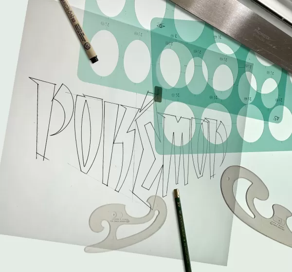
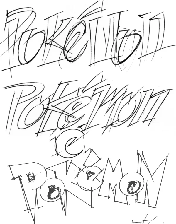
Maple had little to work with—no game to play, just a pile of papers and toys, including a tiny Pikachu figurine. Nintendo offered a brief explanation of the game and showed some monster illustrations, plus an early Nintendo Power magazine draft featuring Pokémon. The logo needed to work on a pixelated GameBoy screen in both color and black-and-white formats.
After crafting several designs, Maple presented them to Nintendo. He started with options he felt less confident about, receiving a lukewarm response. Then he revealed his favorite.
“The room went silent,” Maple recalls. “I stayed quiet too. Then Don James, Nintendo’s executive VP of operations at the time, spoke up: ‘I believe this is the one.’ He nodded, saying, ‘Yep, that’s it.’ Arakawa agreed with a simple, ‘Mm-hmm. Okay.’ Others left the room, and Don told me, ‘Produce it.’ So I did.”
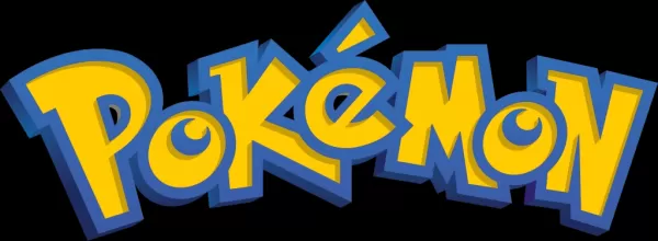
That’s how the Pokémon logo was born. When asked why he and Nintendo gravitated toward the final design, Maple struggles to pinpoint it. “It’s the energy,” he says. “I was trying to capture the story behind the game, its potential, and what it could become.”
Maple’s choice of yellow and blue for the logo stemmed from instinct, possibly influenced by the upcoming Blue and Yellow game versions. Japan’s original Red and Green releases were adapted for the West, with Blue replacing Green and Yellow following a year later. While Maple knew about these versions, he says the colors just felt right. “It’s hard to explain,” he admits. “It just had the right vibe.”
Once finalized, Maple stepped back as Nintendo took over marketing and launching the games. Months later, he got a glimpse of Pokémon’s impact when he visited Toys R Us with his son. “We walked in, and there was this massive display—arches, TVs, noise, and the Pokémon logo everywhere. I thought, ‘This is wild.’”
A Lasting Legacy
Maple’s work with Pokémon didn’t end there. After E3, Arakawa asked for slight tweaks to the logo’s “P” and “E” letters, a common request in design work. Maple made the adjustments, creating the logo we know today.
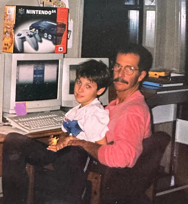
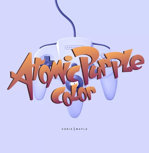
Later, he contributed to other Nintendo projects, including design work for Major League Baseball Featuring Ken Griffey Jr., Mischief Makers, and possibly Star Wars: Rogue Squadron for the Nintendo 64. He also redesigned the Nintendo 64 box for the Atomic Purple release.
Maple dabbled in the Pokémon games but was too busy to dive deep. His son, however, collected the trading cards—until they were banned at school. “My daughter would tell people at stores, ‘My daddy did that logo,’” Maple recalls. “Moms in line would glare at me like, ‘So you’re the one responsible.’”
Maple’s work with Nintendo eventually tapered off as the company built its in-house design team. He was unfazed, with plenty of other projects to tackle.
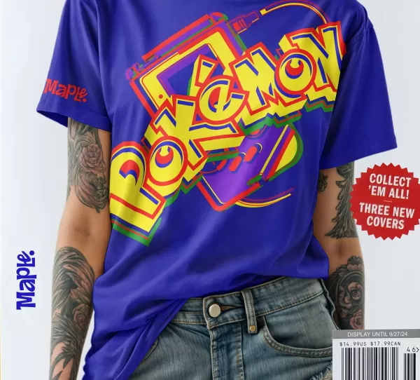
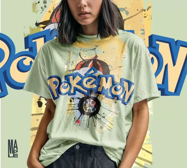
For years, Maple stayed quiet about his role in the Pokémon logo’s creation. It wasn’t on his website, and he received no public credit, which he says is standard in his industry. Recently, though, encouraged by his son, he’s begun sharing his story, adding the logo to his portfolio alongside T-shirt mock-ups and other designs.
Why now? “After 27 years, I figured it was time to claim this achievement,” Maple says. “People who love Pokémon, like you at IGN, deserve to know the real story.”
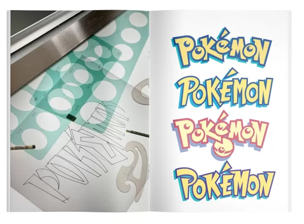
Chris Maple Modern Mock-up Logo Images
 View 4 Images
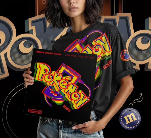
Would he change anything about the logo today? Maple says he’d likely revert to the original 1998 version before Arakawa’s tweaks. He also has thoughts about Pokémon’s upcoming 30th anniversary. “They’ll probably have some artist add ‘30th’ to the logo, but it won’t feel right without the original intent and energy,” he says. “I’d love for Pokémon International to call me to handle it. It’d be great PR for them—and for me.”
Maple’s brief work on Pokémon—a single logo—has appeared on countless products, second only to Pikachu as the franchise’s most recognizable symbol. Does he feel responsible for Pokémon’s global success?
“In a way, I feel accountable for the kids and fans who’ve embraced it,” he says. “I teach in underserved communities, and when the kids find out I designed the logo, they go wild, begging me to draw characters. I’ll sketch a few and put the logo on the whiteboard—it’s a hit. Those moments are priceless. I’m just glad Pokémon’s thriving, and that’s why I keep doing what I do.”
 Latest Downloads
 Downlaod


 Top News