Exploring the Evolution of Kirby's Western Image: From "Angry Kirby" to Global Consistency
This article delves into the fascinating story behind Kirby's differing appearances in the US and Japan, based on insights from former Nintendo employees. We'll examine Nintendo's localization strategies and their impact on Kirby's marketing across different regions.
The "Angry Kirby" Phenomenon: A Western Marketing Strategy
Kirby's portrayal in Western artwork often featured a more determined, even "fierce," expression—a stark contrast to his typically cute Japanese counterpart. Former Nintendo Localization Director, Leslie Swan, clarifies that the goal wasn't to depict anger, but rather to project a sense of determination, a trait deemed more appealing to the Western, particularly male, tween and teen demographic. This contrasts with the Japanese market, where Kirby's inherent cuteness is a major draw, as noted by Kirby: Triple Deluxe Director Shinya Kumazaki. The strategy varied by title, however, with Kirby Super Star Ultra showcasing a tougher Kirby on both US and Japanese packaging.
Marketing Kirby as "Super Tuff Pink Puff": Beyond Cuteness

Nintendo's marketing actively sought to broaden Kirby's appeal, especially among boys. The "Super Tuff Pink Puff" campaign for Kirby Super Star Ultra exemplifies this. Former Nintendo of America Public Relations Manager, Krysta Yang, highlights Nintendo's desire to shed its "kiddie" image, aiming for a more mature appeal within the gaming industry. This shift in marketing emphasized Kirby's combat abilities, moving away from solely focusing on his personality. While recent marketing has attempted to present a more well-rounded Kirby, his cuteness remains a primary association for many.
Regional Differences in Localization: A Historical Perspective
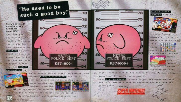
The divergence in Kirby's image between regions began early. The infamous 1995 "Play It Loud" ad featuring a mugshot-style Kirby is a prime example. Subsequent game box art often displayed Kirby with sharper features and more serious expressions. Even the color palette differed, with the original Kirby's Dream Land featuring a ghostly-white Kirby on the US Game Boy release, a decision later acknowledged as a marketing challenge.
A Shift Towards Global Consistency
Both Swan and Yang agree that Nintendo's approach has evolved towards a more globalized strategy. Closer collaboration between Nintendo of America and its Japanese counterpart has resulted in more consistent marketing and localization efforts. The company is consciously moving away from regional variations and aiming for a unified brand image. While this brings consistency, Yang notes the potential for a loss of regional nuance, potentially leading to more generic marketing. The current trend, however, reflects the broader globalization of the gaming industry and a growing Western familiarity with Japanese culture.

 Latest Downloads
 Downlaod


 Top News